Umee Rebrand

a Social Wellness App

October 2023 - June 2024

Rebrand project defining brand guidelines and lightweight design system, then building and integrating across all mobile app screens.

Jump to Final Design

Role

UX Designer

Duration

2 Quarters

Deliverables

Brand Guidelines, Design System, High-Fidelity Brand-integrated Screens

Stakeholders

Design Team, Brand Design Lead, CEO

Tools

Figma, Google Suite, Trello

Project Overview

I collaborated with the Brand Design Lead, CEO, and a small design team on Umee's rebrand project to align its visual identity with its mission and core values. The project involved establishing brand guidelines and a design system, which I then implemented across designs for all mobile app screens and delivered to our development team.

My Contribution:
  • Led integration of branding and design system across all features on Umee app
  • Led meetings, delegated tasks, and reported progress to design and executive leadership
  • Collaborated with design team to deliver brand guidelines and design system
  • Defined brand values & tone through visualization exercises and analysis
The Problem
Inconsistent Design Identity

Umee lacked brand guidelines, leading to fragmented, inconsistent designs across primary app features.

Disconnected Visuals & User Needs

Our brand identity did not resonate with the needs of our app's target user demographic.

Project Goals
Establish a Brand Identity

Ensure the design choices reflect Umee's core mission and values, fostering a sense of community and connection among users.

Design High-Fidelity Screens

Produce high-fidelity wireframes and UI designs for all app screens, ready for the first live launch and development handoff.

Umee's Vision

Umee is an innovative community-building platform that supports members of exclusive communities (gyms, clubs, and other community organizations) by fostering connection and promoting social wellness.

Umee.social
Rebrand Process
Research
Our Users: Following the Research

Our target user group were adults over 40 who are members of exclusive social clubs, such as gyms and community organizations. This demographic was at an increased risk of negative health impact from the loneliness epidemic.

A 2016 meta-analysis found that poor social relationships in this demographic are linked to a 29% higher risk of coronary heart disease and a 32% higher risk of stroke.

Animated demonstration of Umee's users
(Image for visualization of userbase, not made for original project.)
Token System

Umee planned to soft launch to three gyms the next quarter, so we focused our research on gym members to gain an understanding of exclusive communities. We could later apply our insights to other communities more broadly.

Our goal for research was to identify the user goals for our product.

1. What is Umee's perceived value?
2. What can users get out of our product?
3. How can we shape Umee's mission and vision into a product that fulfills user needs and improves social outcomes?
Research Questions

Key questions we needed answered to identify Umee's perceived value:

1.

How are people currently connecting with others in their communities?

2.

What apps are people using to connect with new people?

3.

What do people look for from a hyperlocal social network service like Umee?

User Interviews

I collaborated with my team to narrow down qualitative and quantitative questions, and we specifically chose to interview members of gym communities. These are the two participants I interviewed:

Interview Script
Gavin
Age: 61
Gym: Dale Turner Family YMCA
Gavin, 61, joined the YMCA with his wife through their friends to stay close and get more exercise. He values his time with friends, but rarely meets new people beyond his existing social circle. He’s comfortable with his routine at the Y and believes it keeps him healthy.
Why did you join the YMCA?
“We knew a few people who were already going, and it just felt like a good fit. It's also close by and affordable for us.”
How has the community benefitted you?
“Well, if my wife didn’t go with me or I didn’t meet up with my friends there, I guess I might never go. And I’m not one to get much exercise outside the Y.”
What do you think about an app that connected you to new people at your YMCA?
“Oh, I’m not sure I’d use an app to meet new people. I go to the Y mostly with my wife, and we kind of have our routine... Sometimes it feels like there’s a lot of people, but no easy way to really connect unless you’re already in a class or something. I would probably try it out.”
Elaine
Age: 64
Gym: Bellevue Badminton Club
Elaine, 61, has been a member of the Bellevue Badminton Club for over 30 years. She’s loved playing badminton to stay active all her life, and she’s formed many lifelong friendships through her club.
Why did you join Bellevue Badminton Club?
“Well I’ve played all my life, so I’ve also been playing somewhere... I knew people who members here, and I’ve played with many of the same people for years and years.”
How has the community benefitted you?
“It’s fun. I guess you need people to play, it’s not a one-person activity. I’ve made lots of great friends along the way. The exercise is good too, I guess.”
What do you think about an app that connected you to new people at your club?
“Like WhatsApp? I’m on that. I guess that’d be cool. There’s a language barrier a lot of the time. I’m not sure how an app would deal with that? Something to organize matches and meet up times would be great, we’re always meeting later and later.”
User Insights

Through our user interviews, we found that this older demographic needed to feel the same sense of belonging on the app that they experienced within their fitness communities.

Although they were comfortable with phones and technology, they were initially hesitant to adopt and use a new app within their community.

Change in Business Priorities

Shortly after strategizing our research plan, executive leadership told us they needed to expedite deliverables. This meant we needed to refocus our research and produce insights within the 4-week window we were allotted.


Competitive Analysis

I led research into three competitors where Umee drew most of its visual inspiration: Nextdoor, Hinge, and Meetup.

Competitor Insights
  • Nextdoor most aligns with Umee's mission – provide a platform for users to strengthen connections within their local communities. Though, Nextdoor also has issues with community echo chambers.
  • Hinge's minimalist aesthetic provides a straightforward user experience that directs attention to other users. Minimalism is easy to implement and would leave space for future changes.
  • While users often turned to platforms like Nextdoor, Hinge, and Meetup for specific purposes, the common thread was always a desire for person-to-person connection.
Brand Visualization

Using our research, we needed to define Umee's core brand values to guide Umee's visuals and brand messaging. We worked closely with our CEO to ensure we built from their vision for Umee. My Brand Lead began the visualization process by leading mood board exercises.

Mood Board Exercises

Visualization exercises like mood boards based on our user research helped us refine Umee's vision of fostering community into emblematic words and imagery.

We most strived to capture a sense of "belonging" in our imagery.

When thinking of "belonging" what words and images come to mind? I pictured nature, specifically mountains and the ocean, and feeling part of something much greater than myself – the phenomenon known as the "overview effect".

Defining Brand Values

After weeks of research, visualization exercises, and collaborative discussion, we refined Umee's mission and vision into 3 core brand values.

These values would guide our brand guidelines and design system:

Umee is a warm, cozy place. The experience should be bright and comfortable.

Umee is rooted in empathetic relationships. Genuine emotional connection is the foundation of positive relationships

Umee is for every member of community, fostering connection between users no matter who their differences.

End of Q4

By the end of the quarter, we solidified Umee’s brand foundation. With the app’s soft launch delayed due to development setbacks, we used Q1 2024 to establish brand guidelines and a lightweight design system.

Design

In Q1 of 2024, our goal was to deliver clear brand guidelines and a simplified design system. I then led their integration across all Umee screens—including Onboarding, Match, Chat, and Newsfeed. Guided by our mood boards and core values of warmth, empathy, and inclusivity, we defined the logo, color palette, typography, and overall tone.

Brand Guidelines & Design System

The core components of Umee's visual identity.

Logo
*While this is not the logo our CEO ended up going with, our effort led us to the logo Umee uses today.
Color & Texture
Stakeholders expressed concern that incorporating too many colors would hinder integration by the end of Q1. So, we focused on orange as our CTA color to build from.
Typography
Poppins
We chose the Poppins typeface as it provided a clean and friendly aesthetic for Umee. We later built typography guidelines and type scale with our design system.
Tone
Warm
Nurturing
Energetic
Encouraging
Compassionate
Authentic
Friendly
Casual
Facilitator
Approachable
The tone of our app defined how our users would interact with each other. Establishing a positive atmosphere was critical to foster positive relationships.
Token System

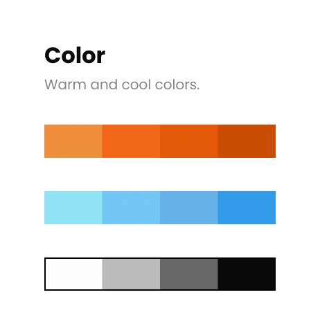
I started a foundational token system for Umee, designed to scale as the project grows.

Spacing
An 8pt grid system was consistent but flexible enough to adapt to screen size.
Text
We broke down our fonts into essentials – what were we actually using?
Color
We reserved orange coloring for CTAs. 
Which Components are we Actually Using?

We had little time to build out our design system, so I advocated for defining components based on need. For example, buttons were used throughout Chat and Match screens, so we should define rules for their color and padding for primary and secondary CTA buttons.

Integrate to Define

After discussions with my CEO and Design Lead, we decided I should define design system components while I integrated Match and Chat screens. This allowed me to prioritize design system components and test their functionality directly, putting us on track for Q1 OKRs.

Integrating Guidelines & Design System
I was responsible for leading the integration of our brand work into Umee's Match and Chat features which two other design teams were working on.
  • Applying branding and design system to Match and Chat screens: logo, font, colors, tone, spacing, and advocating for user accessibility in the designs.
  • Bringing mid-fidelity Chat wireframes to high-fidelity prototypes ready for dev handoff.
  • Creating dev handoff documentation, and meeting with development lead to walk through designs.
High-Fidelity Designs

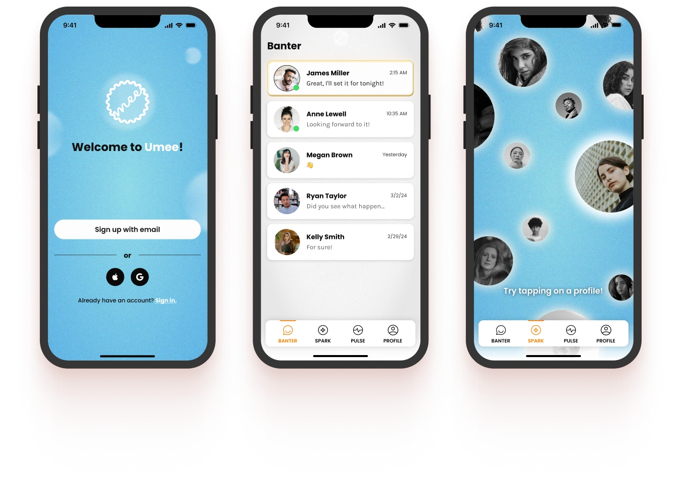
This is the final flow I designed and led.

Mid-fidelity Designs

I designed over 100 high-fidelity screens including all essential user interactions and outcomes across the Umee app.

"Spark" screen prototype - where users find and connect to each other.

Glowing Profile Pictures

A sea of members who joined Umee within your gym community.

Match

A sea of members who joined Umee within your gym community.

Onboarding Figma Prototype

Try out the onboarding prototype for yourself!

Iterative Process

Because these were the first designs to undergo brand integration and I was under a short deadline, the process was extremely iterative. I received daily feedback from my PM and created new designs for her and my CEO's approval.

The brand work laid the foundation, but getting the details just right required a constant cycle of feedback and iteration.

Handoff to Development Team

Dev handoff included creating design specification document for development team (design guidelines, interactions, and animations) and meeting with development lead to walk through both Chat and Match designs.

Impact

The brand and design guidelines created the basis for Umee's visual identity that was grounded in its mission and core values.

Impact across the Umee team

The Match and Chat (Spark and Banter) features I brought to high-fidelity are the core of the Umee app. These features are a design reference for all sequential features and components.

I have become a point of reference for brand governance across the Umee team for the branding and design decisions I made with my rebrand team. Specifically for: Umee slide decks, feature renaming, screen layouts, colors, textures, and buttons.
Future Progress

As new features continue to be built, more design components will need defined:

  • We have a foundation for our design system, but there are still many variables we need to define.
  • A design token system was out of scope for this project, but I have advocated for it to leadership as a system that would greatly support our dev team.
  • I am designing and defining updated branding for Onboarding, Profile, and Newsfeed features.

Conclusion

The true measure of success for this project will come after Umee’s soft launch with three trial gyms. That said, with support from my leads and CEO, the work I’ve done has set Umee on the right path to achieve both our mission and business goals.

More about Umee

Umee is a health & wellness company created to address negative of the loneliness epidemic. Umee's mission is to help members of exclusive communities like gyms, country clubs, and other social groups bond and create new connections.

"The combined insights from studies by Marta Zaraska, Robert Waldinger, and Vivek Murthy redefine our understanding of health and longevity. They show that it’s about more than just what we eat or how often we exercise; it’s about our connections, community, and feeling safe within our communal networks.

Umee offers a practical solution to prioritize our "social fitness" — just as we do our physical fitness. By bridging research and technology, we're presenting a pathway to live longer, healthier, and happier lives. The evidence is clear, and the tools are at hand — it's time to harness the power of connection."

– Umee Mission Statement

Jump to top

Figma icon
PREV
PickUP
PickUP